


Art that inspires my landscape photography (not the famous paintings, I promise)
Apertures. ISO's. Focal lengths, shutter speads, chromatic aberration, barrel distortion, contrast, sharpness, lens blades and glass coatings. It's only too easy in photography to be bogged down by technical details and discussions that make zero sense when you first start learning about photography. Even after a few years seriously studying and practicing landscape photography, some of the more technological side of it still doesn't make much sense to me, if I'm honest. But that doesn't matter. Photography is an artform and art is all about emotion. Some technical knowledge is required to take a photograph executed well enough that its faults do not distract from making that emotional impact, sure, but a photograph is not going to be memorable just because it is perfectly exposed. Or super sharp. What's actually in the photograph, and how it's composed is what is going to draw the viewer's attention - and then keep it. And for inspiration on how to do that, I look towards art. Let me share some of my favorite artworks with you, why I love them, and what I learnt from them for my landscape photography.
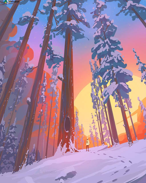 |
| Artist: Arina Mochalova |
What makes this artwork by Arina Mochalova so pleasing to the eye?
First, there's the color palette. The soft blue, orange, yellow and white tints here work really well together. Color theory is a complex subject but a general principle to keep in mind is to pick colors that either lie close together on the color spectrum, or are each other's opposites. In this case, the cool white and blue tones make the warm orange and yellow tones stand out more. In landscape photography you've got less freedom to pick your own colors, but you can keep an eye out in nature for colors that work well together. It's also possible to tweak shades a little in the editing phrase using color toning or the HSV(L) tool. A photo that looks off can really benefit from this.
Second, the artist created a strong subject to look at - the little person. Instead of a mere snowy forest scene, this artwork is now a story of a human walking all alone beneath the high trees, offset by a huge setting sun, looking very small indeed. The artist also cleverly leads your eye towards the subject by framing the person between the tree trunks, just a little angled, and by creating a trail of footsteps towards them. We can't change the landscape itself in photography but we can apply the same techniques. An interesting subject doesn't have to be a human. All kind of things can work: animals, human objects like ships or houses, interesting looking rocks, flowers. I especially love to use my tent as a subject.
Third, there's a sense of depth in this art. Look at how the trees become smaller and more vague once they are more distant. If your landscape photo looks flat, perspective is missing from it. Do the foreground and backfround merge into each other? Look out for ways you can seperate the layers in your photo. Mist, differences in color, shallow depth of field, direct light in one part of the image - it can all work to create this sense of seperation.
 |
| Artist: Graham Gercken |
You don't need humans in your photo to make it compelling. A tree, for example, will perfectly do. Look how well balanced it is in this Graham Gercken painting with the other trees in the background. This tree also isn't positioned straight in the middle - one of the first things you often learn about composition is that an off-center subject will often result in a more pleasing image. The trees in this artwork circle the main tree, gradually fading away in the mist, creating order and a feeling of depth in the chaos of a forest.
 |
| Artist: Heidi Varis |
Photography doesn't always have to be all about epicness and complex layers and grandiose views. Sometimes photographs have more impact when you simplify them. This artwork just breathes serenity. How does Heidi Varis archieve this? First there's the color scheme. The chosen tones lie close together - no contrasting colors, but rather linked shades of blue and green and purple. That creates calm. There's also harmony in patterns - the flowers, the trees, the clouds, without one element dominating, a simple repetition that ties into each other instead of drawing the attention to one single element. A view I'd love to hang upon my bedroom wall.
 |
| Artist: Erisiar |
Another way to create simplicity in landscape photography is to leave a large part of the foreground or the background out. This art work by Erisiar beautifully shows that a sky on its own can be enough - just so long as it's an interesting sky, and there's a little bit of foreground added for a sense of context and scale. When I'm looking at a boring sky but see something really interesting directly in front of me, or the other way around, it's a good time to try this composition technique.
 |
| Artist: Zandraart |
The final art work I'd like to share with you is this mountain landscape - an intriguing study of frames, pointy shapes and sheer ridges. There's plenty for your eyes to explore. The blue night tones and snow only add to the cold atmosphere. The whole painting just breathes coldness and danger, not quite a place for humans (but excellent for dragons and wizards).
What do you want to express with your photo? Exhilaration, peace, solitude, uncanniness, multiple things at once? All is possible. If you can answer that question for yourself it becomes easier to attain the desired effect.

Comments
Post a Comment